BMW TOS Page
Transformation of a dense legal document into a user-friendly experience. Easier to navigate and understand.
- information architecture
- accessibility (WCAG 2.1)
- visual clarity
- ux
- ui
Lack of semantic structure, contrast ratio could be better.
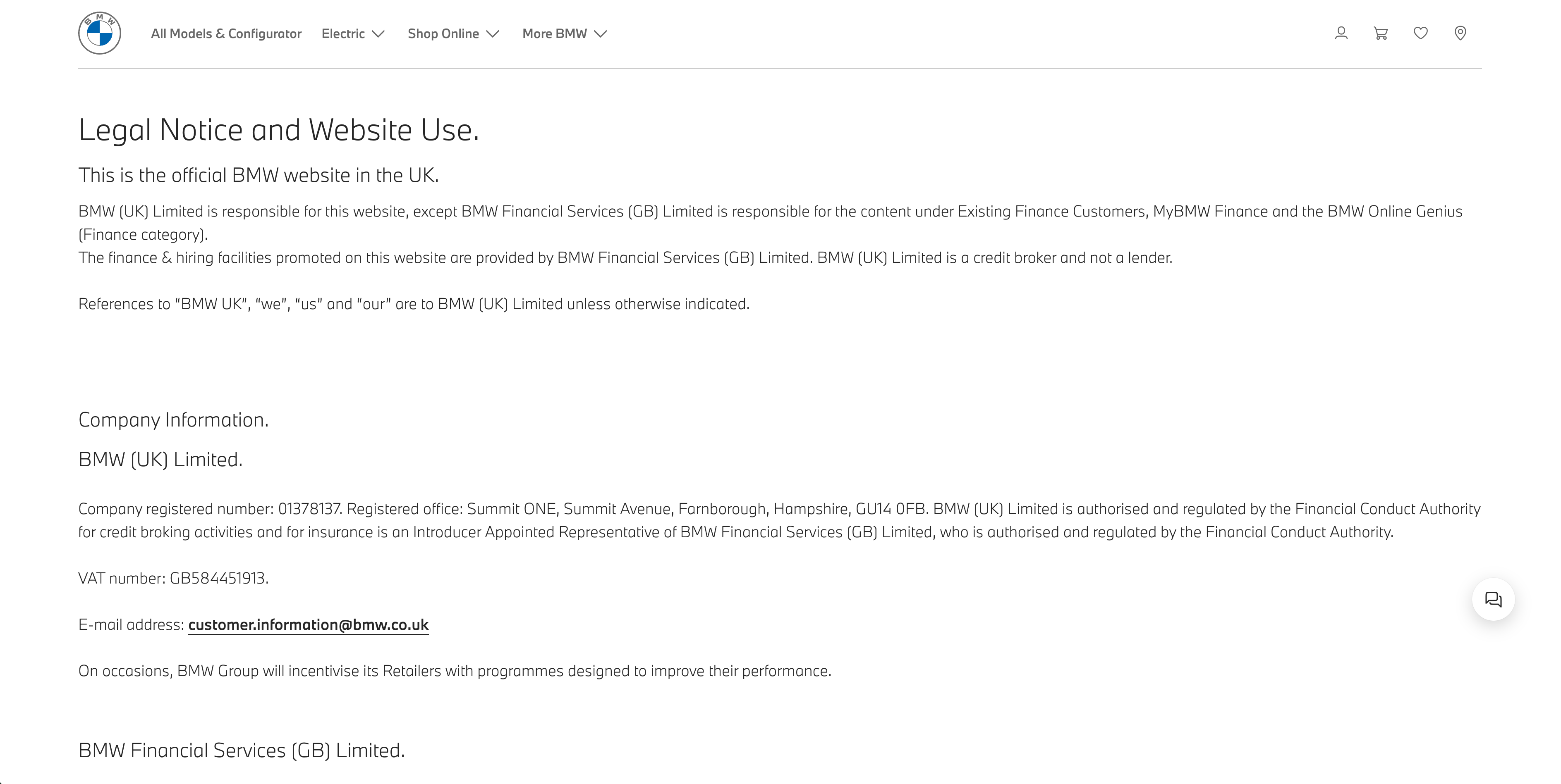
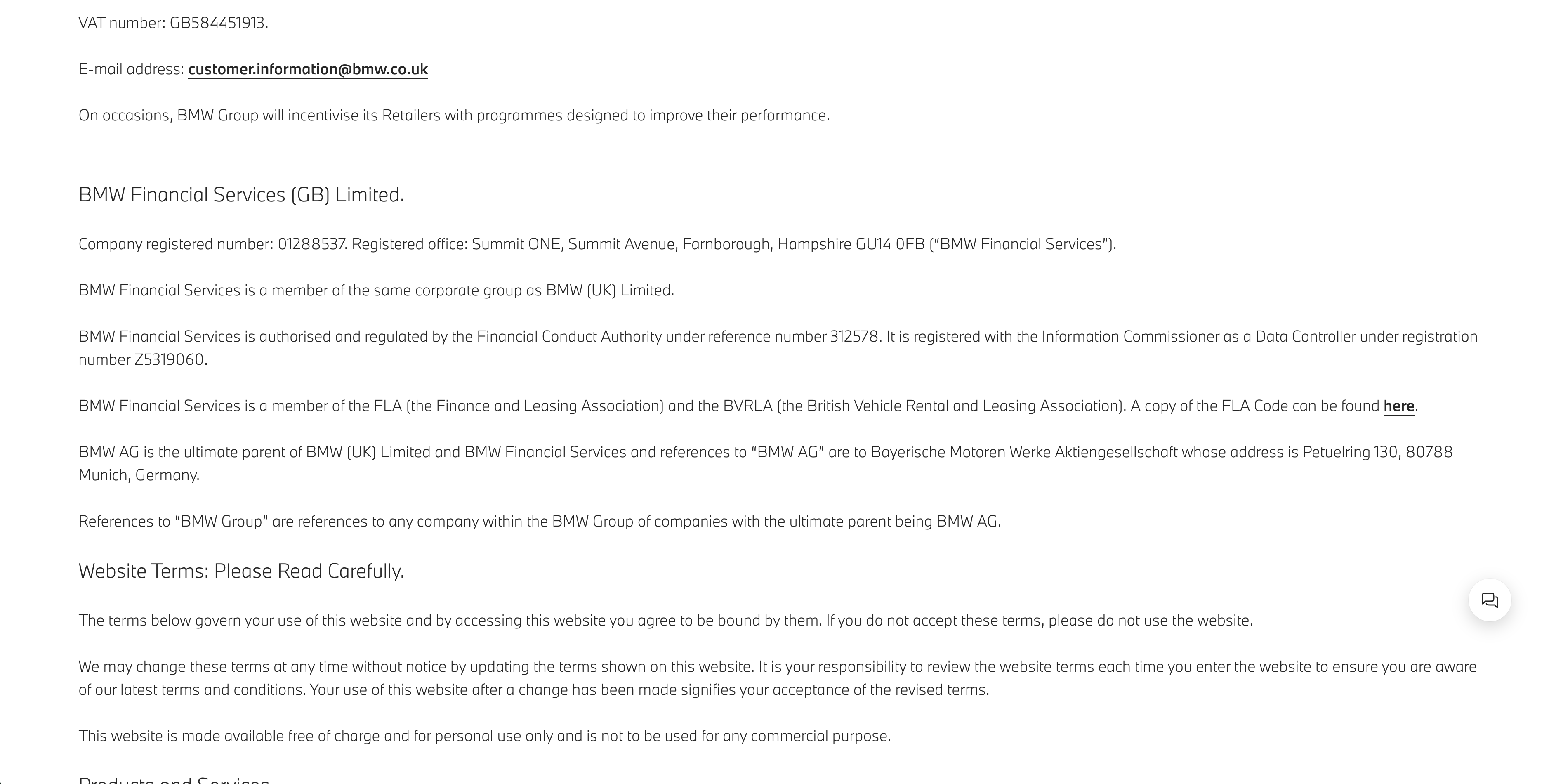
Sections feels dense, formal, and not visually engaging, which can deter users from reading or understanding important information.
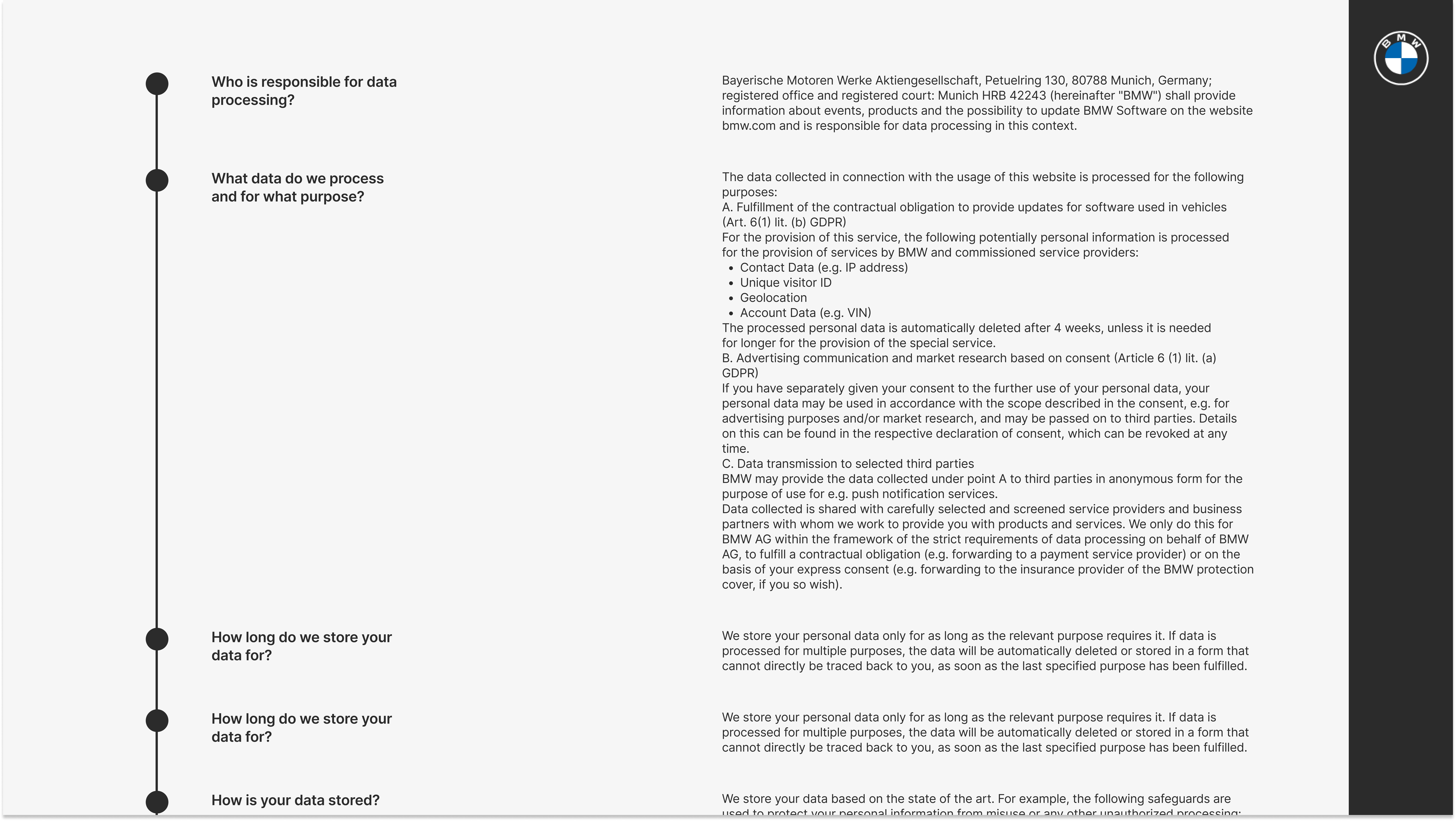
This landing moment establishes immediate clarity: clear H1 headline ("Terms of Service") to anchor user expectations. Supporting bullet list gives a quick scan of what the user can find here. The visual language supports BMW’s premium tone while softening the cognitive load of legal reading.The menu stays consistent and easily scannable, following Jakob’s Law and enhancing orientatio
Design impact: users can identify the purpose of the page within 3 seconds. No scrolling or guessing required.
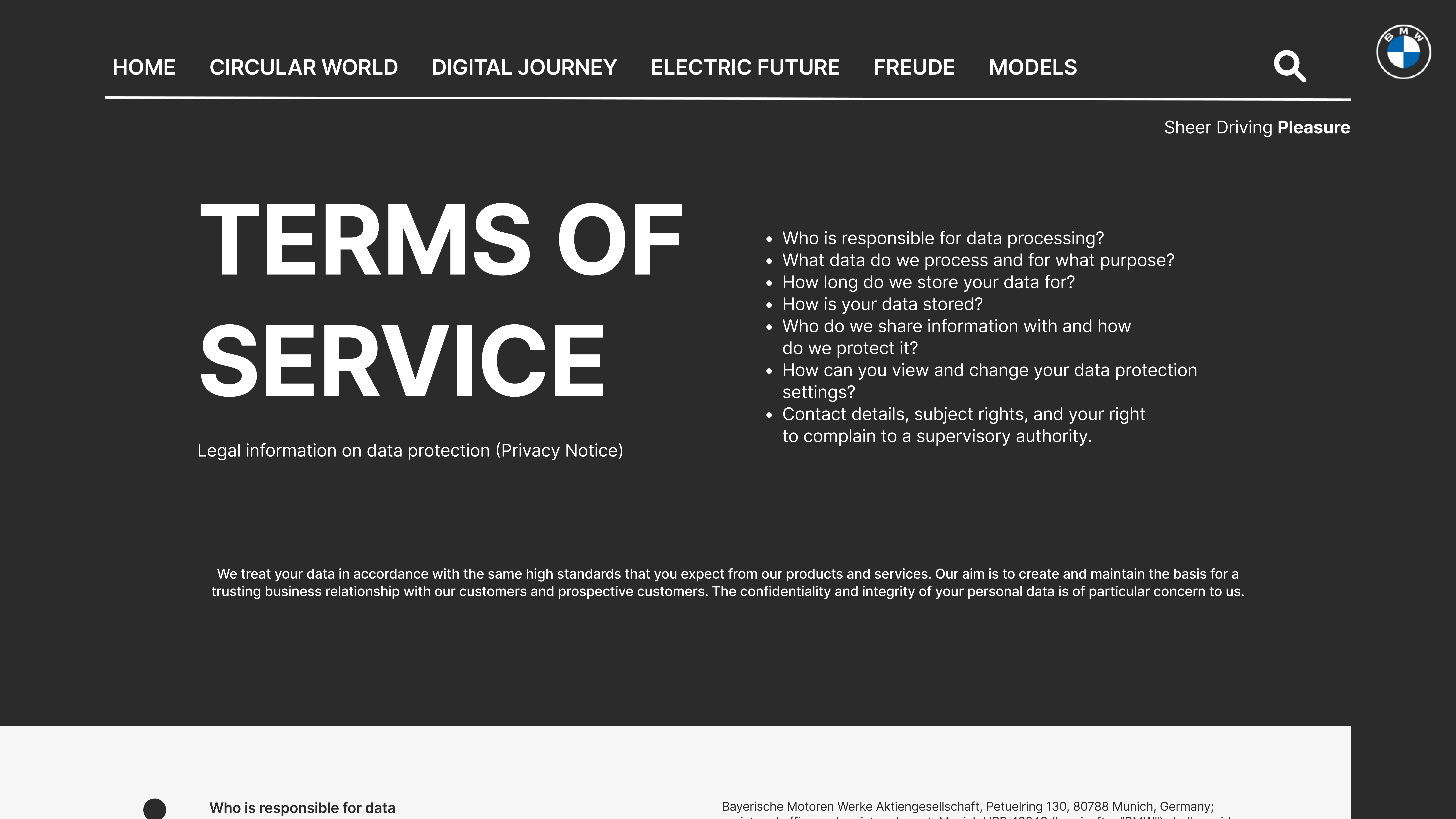
Instead of dropping users into a wall of text, I introduced a timeline-style layout: dotted navigation (styled to subtly resemble a vertical track) allows progressive disclosure of information. Each section begins with a clear question, following conversational UI patterns to reduce formality and build connection. Key legal elements like data usage, processing purpose, and consent are visually separated, making it easier to understand without legal fluency.
Accessibility enhancements: headings marked semantically (H2s, H3s), color contrast improved for readability, ARIA-labels introduced for assistive tech users, logical tab order and clear focus states.
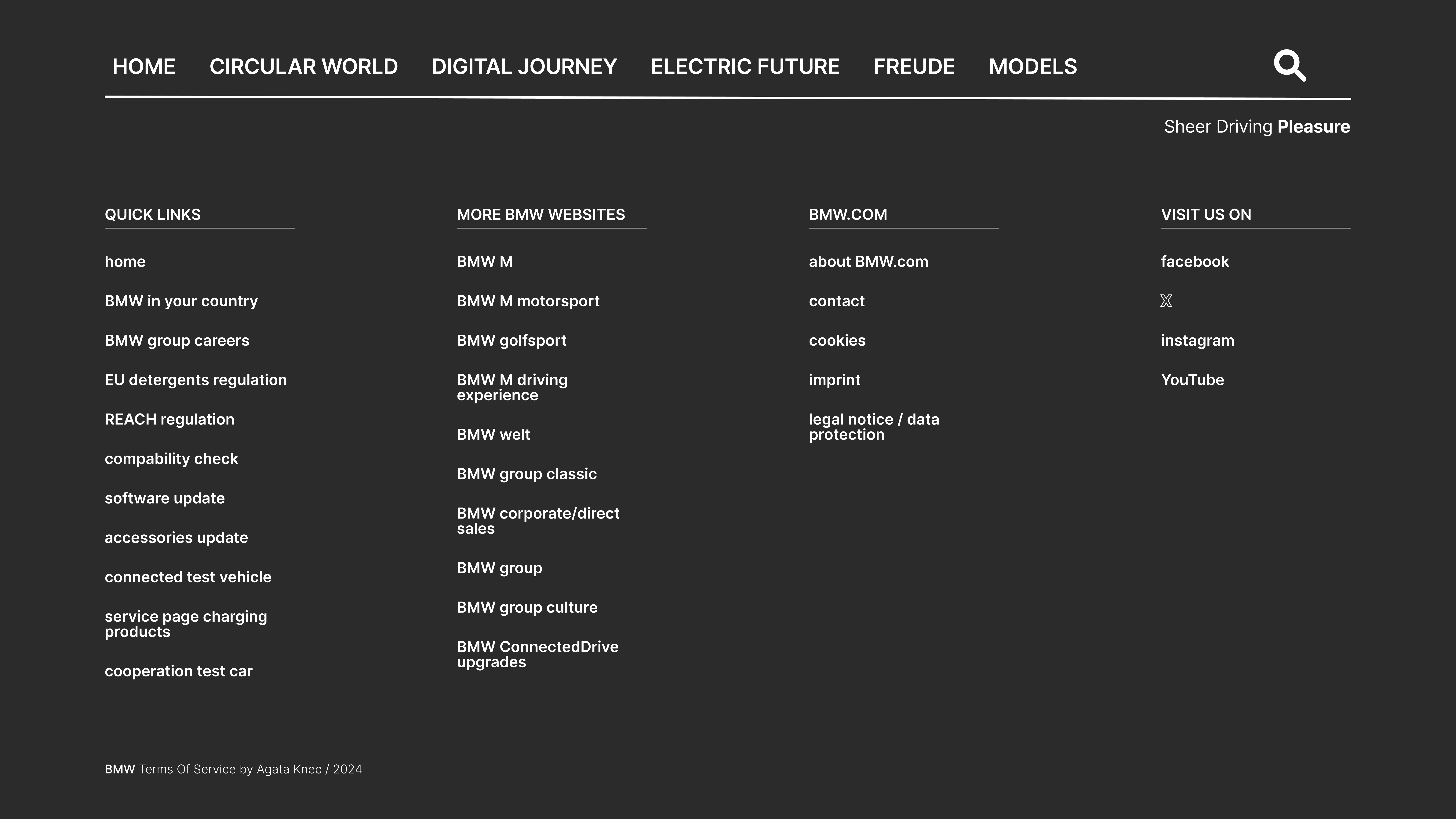
Most terms pages leave users at a dead end. Here, I crafted a "dig deeper" footer that acts as both a sitemap and soft re-entry into the broader BMW digital world: three-column layout keeps content scannable.
Left: quick links for service-related needs
Center: ecosystem of BMW sites for continued journey
Right: brand trust signals via social media and legal links
Smart horizontal navigation enables “what else can I do?” without needing to scroll back to the top.